
Over thirty years ago, back on February 1, 1993, Microsoft’s co-founder Bill Gates showed off a brand new product, the Wallet PC. He heralded it as a device that would make it unnecessary to carry around cash, cards, and photos.
“There’s no reason why you can’t just carry a single little PC about the size of a wallet,” Bill Gates told the Seattle Times.
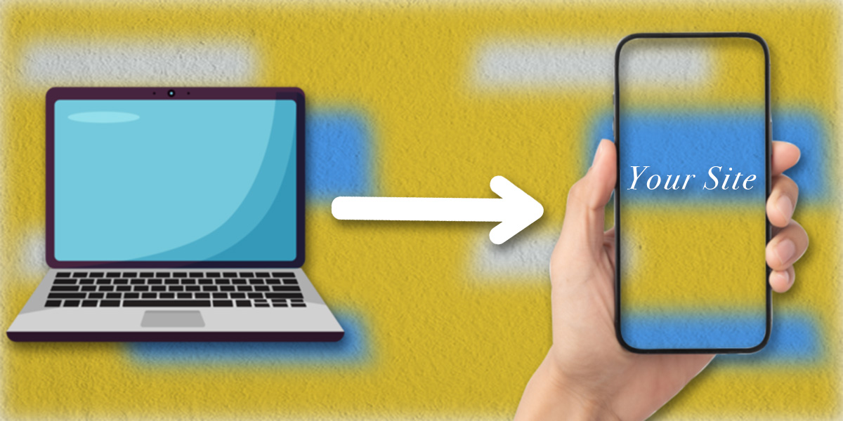
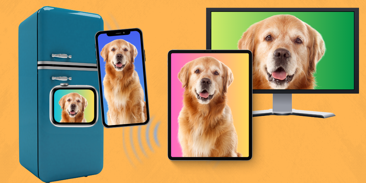
While no one in the world remembers the “Wallet PC,” what Gates predicted about the future portability of computing was spot-on. These days, billions of people have smartphones they can carry around in their pocket, and all of those smartphones can access the internet. That means people do not need to use a desktop computer or laptop to access your website. But that’s the rub: many people still do use traditional computers to surf the internet. To make things more complicated, many people may also access your website using a tablet, or a Smart TV, Smart Refrigerator, or any number of other devices with the necessary display, connectivity, and computing power to access the internet.
The ability to access websites on displays and devices of different makes, brands, and sizes is a necessary convenience for modern audiences. However, designing websites simultaneously for both mobile and desktop audiences can be challenging to do well. From the limitations of screen space to handling the different ways mobile and desktop users interact with screen elements, here are some of the hurdles web developers must overcome to present you with an aesthetically and technically pleasing website experience regardless of the device you’re using.
Designing For Different Audiences
Imagine you are an interior decorator. Your client gives you the task of decorating two separate properties, with the condition that you are to use the same exact furniture, appliances, and decorations at both of them. The first property is an expansive 5,000 sq ft mansion. The second is a 600 sq ft studio apartment. When you consider the logistics of this task, you can start to understand how web developers feel when having to design websites for both desktop and mobile audiences.

Reinvention Rather Than Optimization
As a general rule, web designers do their work on computers. This is because the software for designing websites is made on, and for, computers, and because computers are usually much more powerful than smartphones and tablets. But this also means that the first experience web developers have with the websites they design are on their own computer screens, and on the version of their websites intended for desktop users. It is because of this that they get used to the width and freedom of computer screens. They are spoiled by the space, and ability to have larger and more ambitious design elements to work with. Mobile devices, in contrast, are a more vertical medium.

It is only after getting their website just how they want it for desktop users that many web designers begin to work on mobile optimization and design. Some web designers see designing websites for mobile as a necessary evil, whereas others see it as an opportunity to lean into what smartphones do better than computers. Here at Raptor, we are proud to be in the “mobile design is an opportunity” camp.
Working to Mobile’s Strengths
To illustrate some differences between desktop and mobile design, I am going to briefly discuss a web design feature that is not available on mobile, but is on desktop. When you use a mouse, you have a cursor, which you use to click on different elements of a website. If you move your mouse cursor over a website element (such as an image, textbox, or button), this is known as “hovering.” A web designer can create what is known as a “hover effect,” which can change an element’s attributes (a text box might increase in size by 10%, or expand to reveal a larger paragraph) or visual aesthetics (a button might change color to indicate that a user’s cursor is in the right place to click on it) that activates when a user’s cursor hovers over it.
Hovering is not available on mobile websites. You cannot really hover with your thumbs. But that is not super important, because hovering is mostly used to help you recognize where your cursor is at any given time, and give emphasis to what it is pointing at. You always know where your thumbs are. That is an advantage mobile sites have, not a limitation.
When we work on the mobile version of a site, we can create a flow and layout that is specifically designed for them. This means including style elements that are only available to mobile users, and embracing the innovative software elements that are innate in just about every smartphone out there. Mobile users can easily zoom, scroll, and pan with their fingers. Since they require the use of your hands, mobile sites are more interactive than their desktop counterparts, and are accessible to a larger userbase at any given time. If you lean into that accessibility and interactivity, you can create appealing, engaging, and immersive websites.
Interested in a Website or Website Redesign?
If you are interested in revitalizing the online face of your business, you can read more about the innovative custom websites we create for our clients here. If you are interested in reaching out to us about creating a new website, redesigning an existing website, or working with us on any facet of your digital marketing needs, you can contact us here.